There’s a particular facility where I find myself spending a significant amount of time working. It’s a nice place, fairly new, and the people who work there are very friendly and helpful. The one thing that always strikes me as odd about it, though, is their overzealous commitment to not only “being green,” but in the lengths they go to in order to prove just how “green” they are. In fact, they’ve made some changes in recent months that I feel take the concept to a ridiculous level. Even though I’m not supposed to be allowed to bring a camera into this facility (which is part of the reason why I’m not mentioning the name of it), I went ahead and took some pictures with my phone to show what I’m talking about.
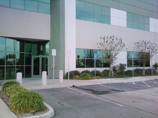
When we first moved into this place, I spent about a month working there every day. I then had no need to be physically present for a couple of months, but recently I’ve found myself there again most days. The first time I returned after an absence, the fact that they’d made some changes (I’m sure they’d call them “improvements”) was obvious even from the parking lot:
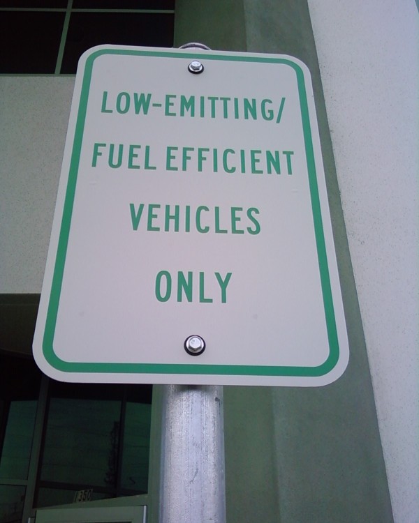
The spots with the white signs—the ones that are actually closer to the entrance than the handicapped spots—are now reserved for “low-emitting/fuel efficient vehicles.” (Yes, I realize that the handicap parking spots are closer to the wheelchair ramp in the sidewalk, but it still seems funny to me that if you drive a Prius you get a shorter distance to travel to the entrance than somebody in a wheelchair.)
Of course, the several times that I’ve been to this place since noticing the appearance of these signs, I’ve never seen a vehicle parked in those spaces, low-emitting or otherwise. I’ve considered using them myself, just because, but I’m pretty sure they have carte blanche to tow me if they so choose.
On the front door to the facility is a sticker proudly proclaiming that they are a “Bay Area Green Business,” which I suppose isn’t such a big deal, as far as self-congratulating back-patting goes.
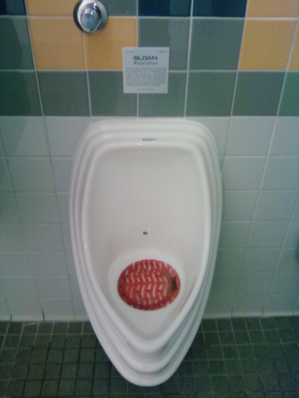
What cracks me up the most about this place, though, are the bathrooms. They, too, have been renovated in order to become more “green,” and the results are nothing if not strange. The urinals in the men’s rooms were replaced by “waterfree” versions:
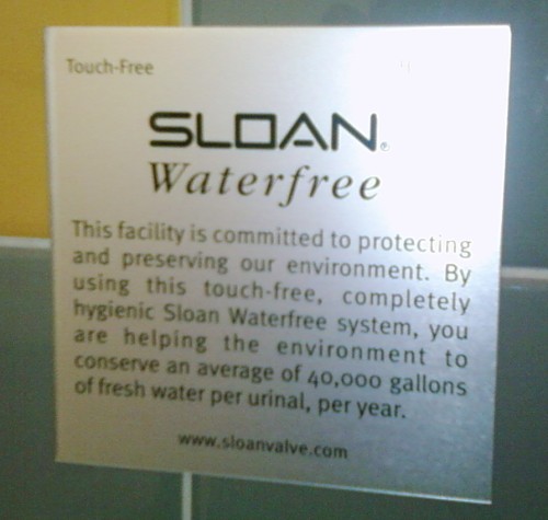
A quick search reveals that these are the WES-2000 model from Sloan, which utilizes some sort of cartridge to collect “sediments” while all liquid goes down the drain. Visible on the wall in the above picture (next to the capped pipe end where the water supply for the old urinal used to be) is a sign that they’ve proudly mounted, informing the user of the great environmental impact of using waterfree urinals.
I’ve had plenty of opportunities, while standing in front of these things, to do the quick mental math required to become a bit dubious of this claim. If the average “normal” (“old?”) urinal uses 40,000 gallons of fresh water per year, at 1.6 gallons per flush, that means it is flushed 25,000 times per year, or 68 times a day. Maybe in a busy bar, I could see this, but in a low-traffic establishment (which this is), that seems preposterous to me. (Even Sloan’s own website doesn’t make such lofty claims, estimating the water savings instead between 9,600 and 24,500 gallons per year… Although, if Sloan didn’t make that sign, who did?)
I assume that I’m not alone in that, when hearing the words “waterfree urinal,” the first thing I think of is “stale-piss-smelling bathroom.” Thankfully, this is not the case. The WES-2000 has some sort of air freshener in it, so that it always exudes a strong scent of cinnamon, which is decidedly better than the alternative.
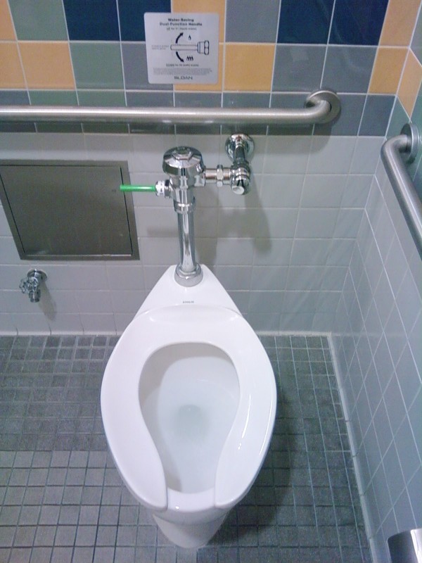
The eco-friendly measures in the bathroom don’t stop at the urinals, though. They’ve also replaced the flushers on the toilets in the stalls with the “UPPERCUT,” a water-saving “flushometer”:
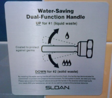
The bright-green flusher handle is the “Dual-Flush Flushometer.” My favorite part of all of this, I think, is the sign describing how to make use of its water-conserving features:
This is without a doubt the most formal use of the terms “#1” and “#2” I’ve ever seen. I didn’t receive a copy of the memo, but thankfully this sign is there to help explain things for me. (I also note how much exaggeration is inherent in the little water-droplet icons: they seem to imply that the “up” flush uses 1/3 the amount of water as the “down” flush, but in fact the ratio is actually a little over 2/3—1.1 gallons instead of the typical 1.6.)
Personally, I think they should have a special sticker one receives as reward for taking a dump that can be flushed with the “up” flush. It certainly wouldn’t surprise me to see “I’m a green pooper!” bumper stickers while driving around Silicon Valley. That’s how these people are.
When I was 15, my family moved to Naperville. A year later, a family moved into the house a few down from ours, and we found out that they had a son, Brant, who was about my age and was going to be on the drumline (which I was also a part of). I met him shortly after they moved in, and we more or less immediately became friends. That was about 12 years ago now, and Brant and I don’t see each other as often (he now has two children keeping him very busy), but we keep in touch and stay caught up as much as possible.
The first thing I learned about Brant was that he was an incredibly talented drummer. Early in our friendship he was proud to show off videos and demo tapes from the band he’d been a part of back in the St. Louis area, where his family had moved from. I’ve always supported him in his various musical endeavors, from high school on. These days, he’s in a band called Veritae, based out of the Chicago area.
A little over a year ago, Brant contacted me about helping him set up a Web site for his band, and I happily agreed to help in any way I could. What I soon found out, though, was that this was not to be a “normal” Web-design endeavor. As part of the deal his band had made with their producer, they got Web hosting along with their studio time. This wasn’t just Web hosting, though; it included a Flash-based site creation tool called Habitat that I would be using to create their site.
It’s worth noting at this point that generally when I make a Web site, I do it using one tool, and one tool only: vi. So a completely Flash-based graphical tool that designs a Flash-based Website for you is about as much of a polar opposite from my preferred style as you can get. This causes, unsurprisingly, quite a bit of frustration on my part. I’m sure some people find the idea of this Habitat tool to be a great idea; even I can admit that it’s novel. I’m certainly not alone, however, in my criticisms of Flash.
It’s been an interesting experience, then, trying to keep the band happy with the site, while at the same time loathing myself for using something and creating something that I consider to be a great example of everything that is wrong with the Internet. It loads slowly, uses way more bandwidth than necessary, is completely inaccessible, and requires a browser plug-in in order to view any of the content on the site. The one thing the Habitat guys deserve credit for is making a Flash-based site that is bookmarkable. However, this was at the cost of additional load times when you traverse between sections, so even that can’t be viewed as a total positive.
I have to remind myself, though, that this is the music industry, and flash (with a lower-case ‘f’) and style can make all the difference in the world when trying to catch people’s attention. This is the same industry that uses MySpace as of late as its primary means of independent publicity.
After several months of inactivity, there was a crash with the band’s site, and I’ve spent some time yesterday and today recreating it. I’m not happy with it, and still have several gripes, but feel it my duty nonetheless to advertise Veritae’s Web page and drive any traffic I can to their site.

