
As I mentioned previously, about 6 months ago I switched from DirecTV to Insight Digital cable service, giving up my beloved DirecTiVo in the process. The experience has made me appreciate–and miss–the care and attention to detail that went into the design of the TiVo UI. I’d like to enumerate in detail exactly which design mistakes Motorola’s engineers made that TiVo’s accounted for. Simultaneously, CK is going to do the same thing in reference to his DirecTV Plus HD DVR, which he recently switched to.
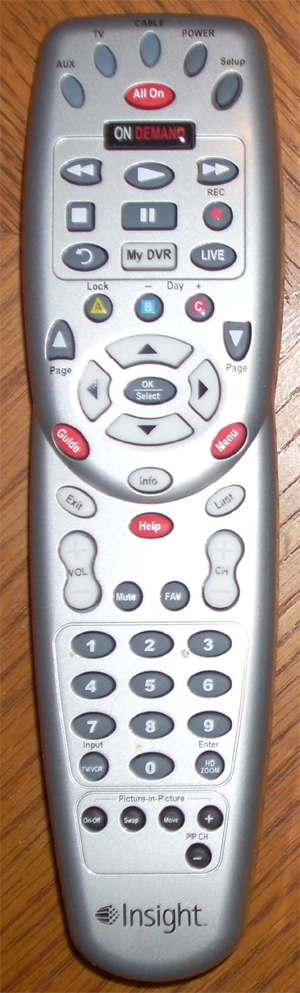
We’ll start with the remotes. CK has already written his comparison, finding squarely in favor of the DirecTiVo’s remote (unsurprisingly). Now it’s my turn to take a look at the remote that comes with the Motorola 6xxx series of cable boxes. I have the Motorola 6416, which is the dual-tuner HD-compatible version with a 160GB hard drive.
In the interest of full disclosure, I should mention right up front that I haven’t used this remote much, as after the first week or so of having (and hating) it, I programmed my Harmony 880 (possibly the second-greatest TV-related invention, after TiVo itself) to control the new DVR, and tossed the Insight remote into a drawer, never to be used again. Here are the main reasons I have for thinking that every user of one of these cable boxes should do the same:
- Too many similarly-shaped and -sized buttons. While the “On Demand” button is nice and big and easy to feel for in the dark, that’s not the one I’m going for most often when I pick up the remote–usually it’s the pause button, or the video transport buttons. They’re all about the same size and shape, and grouped in a 3×3 grid. On the plus side, when picking up the remote your thumb naturally goes to the “OK/Select” button in the middle, which is a good “home position” to start from. It’s just that it’s hard to go anywhere from there except to the arrow buttons immediately surrounding it.
- Page up/Page down buttons. These buttons are stupid, because it makes much more sense to use the Channel up/down buttons for this functionality, when in a context where going up and down by page makes more sense (like being in the on-screen guide). This is the way TiVo does it, and using the Channel buttons comes very intuitively and works quite well. Not only has Motorola chosen to use separate buttons for Page up/down, though, but they’ve also placed them on opposite sides of the remote, making it impossible to easily go between them when browsing through the guide.
- The most important buttons are small and poorly-placed. With the notable exception of the aforementioned OK button, the most important buttons are in the worst possible places, with the worst offenders being the Guide and Menu buttons. The My DVR button also gets blended into the array of video control buttons towards the top; this is the button that brings up your list of recorded programs, so on a DVR box, it gets used a lot (TiVo users will know it as the List button).
- Too many “back” buttons. Perhaps as a sign of skittishness (or, more likely, a testament to how confusing their software is), the developers have given the user multiple ways to go backwards at any point in the interface. There’s a Last button to go back a screen, which does the same as the left arrow button in most circumstances. There’s an Exit button which exits out of the menu system completely. Then there’s a Stop button, which really doesn’t make much sense to me. When you’re watching TV, or a previously-recorded show from the DVR’s hard drive, what does the concept of “Stop” mean? Well, it certainly doesn’t mean you want everything to stop and go to a blank screen, as it would on a VCR. The TiVo engineers thought of this, and so TiVo remotes do not have a Stop button at all; instead, you simply press the appropriate button to indicate what you want to do next. If you’re currently watching a recorded show and want to switch to live TV, you press the Live TV button. If you want to go back to the menu of recorded shows to watch a different one, you press the List button. Stop doesn’t make sense in the context of a DVR, so it shouldn’t be there at all.
- Important funcionality missing. While there’s a “review” button (the circular arrow pointing “backwards,” found just to the left of the My DVR button), there is no equivalent “skip” button. This is especially odd when you consider that the box actually has this functionality–using my Harmony’s “replay” and “skip” buttons, I can skip backwards 15 seconds or forwards 30 seconds, respectively. Why only the “replay” feature has a button on the stock remote is a mystery to me; particularly when you consider the typical length of a commercial, the 30 second skip feature is arguably the more useful of the two. You might also notice that even though this remote is for a dual-tuner DVR, there is no obvious way to switch between tuners–keep reading for an explanation of that glaring omission.
- Picture-in-Picture buttons. These are especially confusing, since the box does not have picture-in-picture capability, and so the buttons serve no purpose… with one very notable exception. Having omitted a tuner-swap button in their design of the remote, the box’s engineers have chosen to co-opt the “PIP Swap” button for that purpose.:
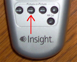
When I first got this box, for the first several days of using it I was actually under the impression that there was no way to explicitly switch tuners (this was an action I was used to performing quite regularly with my DirecTiVo). I mistakenly thought that the only way to utilize the dual tuner functionality was by side effect: if it is recording a show and you try to change the channel, a dialog box will pop up offering the option to switch to the other tuner. I would then be “stuck” on the other tuner, unless I went into the My DVR interface and selected the show being recorded to watch. I’ll touch on this more when I do my review of the DVR software, but suffice it to say that this was confusing and annoying. Even after figuring out how to swap tuners, it is still very non-intuitive to have to use a tiny button at the bottom of the remote in a group of otherwise unused (reserved for future use, maybe?) PIP buttons in order to take full advantage of the DVR’s two tuners. Luckily, on my Harmony I’ve programmed a custom button called simply “Swap,” and it’s in a much more easily-accessible place on the remote.
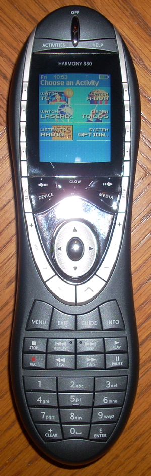
The remote’s deficiencies are a telling sign of the amount of thought that went into the design of this cable box overall. Especially when contrasted with the brilliantly-designed TiVo remote, it falls very short. The Harmony 880 (pictured at left) that I use and love, while not quite matching the TiVo remote in terms of button layout and intuitive feel in your hand, comes pretty close, while also offering the additional functionality of controlling all of your home theater components by itself and being completely programmable. I honestly don’t think I could put up with the stock remote that came with my Motorola DVR provided by Insight for any significant length of time, especially after having used a TiVo remote for over 3 years; luckily the Harmony means that I don’t have to.

